
Adventures in eLearning
GEMINI VIII MUSEUM KIOSK
Adventures in eLearning
GEMINI VIII MUSEUM KIOSK
This is one of my favorite eLearning adventures. I had too much fun designing and developing the Gemini VIII Learning Kiosk for the Armstrong Air & Space Museum.
As a huge fan of the space program, having the opportunity to tell the story of the Gemini VIII mission, from its first docking to its life-threatening emergency, was an amazing experience. The following covers all the ins-and-outs of the development process, including my needs analysis, instructional, design, and development approaches – all the things that bring this project to life for the museum’s many visitors.
Before I tell you about my eLearning adventure, let me first provide a little background and tell you about the adventure of Gemini VIII…

Project Conception
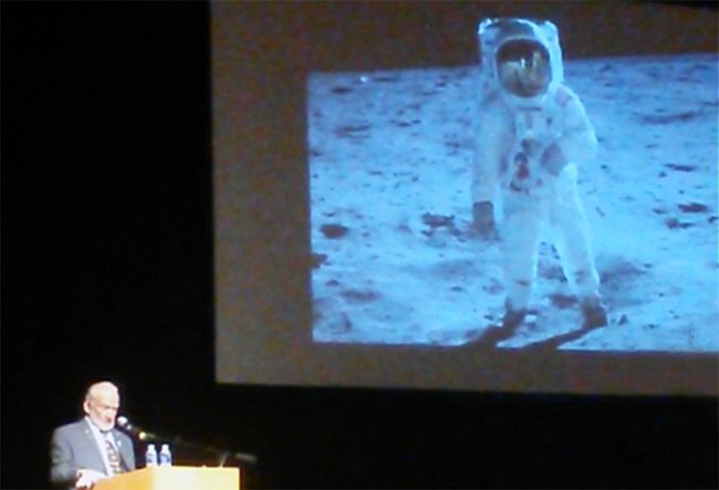
Buzz Aldrin discussing his iconic Moon photo.
My wife, Sarah, and I spent the day in Wapakoneta, Ohio, Neil Armstrong’s boyhood hometown, to visit the Armstrong Air & Space Museum and attend a presentation by Buzz Aldrin. Buzz, the first man to land on the Moon with Neil, told us about his trip and first steps on the Moon. Amazing.
Before the presentation, we toured the museum. It was all things Armstrong and all things space. It is jam-packed but its centerpiece is the original Gemini VIII spacecraft.
As we rounded the spacecraft, I wanted to find out more about it. The museum didn’t have a lot of details on the mission. There were no details about the docking or the emergency, which I knew a little about. I did a mini-needs analysis in my head (I will talk more about this shortly) and thought that an educational kiosk would compliment the spacecraft nicely.
Once home, I developed a prototype in Storyline and managed to get in contact with the museum to ask what they thought of the idea. Luckily, they thought it was in perfect alignment with several updates they were making to the museum’s exhibits and the addition of a brand new classroom that would be built. It also aligned with the upcoming 50th anniversary of the first Moon landing on July 20th, 2019.

Prototype Tip
I build prototypes when I either need to work out the experience for myself or I need to present the experience to someone else. I typically like to use a screen recording program like Camtasia to record myself clicking through the prototype and I record my voice to narrate the experience. This allows:
- Full control of the story. You can discuss the key instructional features and benefits through your narration that a user may not fully understand by clicking through themselves.
- A more functional looking prototype. When you drive, you can make your project seem more finished then it really is by driving the focus towards what works and away from what is incomplete.
This is great for your samples too. With a video sample, you can get right to the point, where a link might take the user some time to find that knowledge check or area you really want to show off. That said, sometimes it makes the most sense to let your client or stakeholder interact with your project directly. It’s a judgment call but consider all options.
NEEDS ASSESSMENT

Luckily, my initial mini needs assessment was on the mark. Brittany and Greg, from the Armstrong Museum, and whom I was working with on this project, helped me further analyze the need for additional education.
We didn’t have any required performance goals to meet, but wanted to provide visitors with the opportunity to reach a number of educational goals. The museum would occasionally have a staff member stand near the capsule and provide information, so they had a lot of knowledge about visitor’s interest and questions they ask (at all ages). Here is a breakdown of the needs as we saw them:
DESIGN

Designing the Experience
I like to begin a project by considering what kind of user experience is most advantageous to the information I am trying to educate or train someone on. This isn’t just the visual design of the project, how the navigation acts, or the instructional approach. It is how all these elements work together to create a cohesive learning experience for the user.
This is for a museum exhibit directed towards all kinds of visitors with varying interests. Ages range from approximately 5 to 100. Some visitors will want to explore the entirety of the kiosk, others have distinct questions they want to be answered, and some may just want to see the videos and images and relate them to the actual spacecraft in front of them.
Here is a snippet of my thought process regarding the experience I believed would fit the project needs:
- To draw people in to the spacecraft and the kiosk, if the kiosk has had no interaction for an amount of time, I want to use a screen saver mode with video from the mission to further engage the visitor so they approach with interest.
- The visitor should feel immersed in the material, so I want the images and videos to be big and fill the screen as much as possible.
- We should meet the goals defined during the needs analysis. Visitors should on average leave the museum with a better understanding of the mission and fulfill their own questions and intests, so information should be grouped up into categories and easy to find and navigate.
- We should break the on-screen text into what is most important and then additional details, so those that want to skim or read a little can learn quickly, then, for those that want to keep reading or want additional detail, can continue as they like.
- The navigation should be simplistic and out of the way. It should let the user know where they are and where they might go if they are looking for something specific. If the navigation was across the top, it would be the first thing visitors would look at. With a bottom based navigation, the visitors would first see the project information. It is also easier to reach if the visitor is a child or if they are in a wheelchair.
- Each visitor should feel free to view anything they wanted at any time through an open navigation scheme.
- The background should be dark. A white background might cause unessesary light on the capsule and might draw your eye away from the physical spacecraft.
- The title “Gemini VIII” should be on screen at all times and prominent enough to act as a visible title for the exhibit, as the spacecraft itself doesn’t have a clearly marked mission title.
Designing the User Interface
By first defining the user experience, I have goals and a direction to build out the user interface design. I don’t typically like complex user interface designs. The less they see in a design, the more they see in terms of content. The capsule has many angles to it and so I use an angled line to subdivide the design between images, videos, and text. I ran all my designs by my friend Joe who reviewed the project for inconsistencies and provided a number of design considerations. I highly recommend showing your designs to others and take in the feedback they provide. It will lead you to produce much better eLearning experiences.

Designing the Storyboard
Chris, Brittany, and Greg, at the museum, worked with me to define the most important categories and subcategories to cover on the kiosk. This was based on the information they have documented and the typical interest and questions they have from visitors. I put together a storyboard template with instructional and design considerations, so they could fill in the details and note any images/videos that they know exist. This was incredibly helpful to me during my development process. These individuals know so much about the mission and how to relate that information to the visitors they have. As they populated this, I continued working on user interface design concepts.

3D Development
Tony worked with me to develop the 3D animation used to visualize the emergency. Greg, from the museum, provided a detailed description of the emergency, the orientation of the spacecraft as it rolled out of control, and even snippets from the Gemini manual to help with our accuracy. We used 3D Studio Max to output the animation and then Adobe After Effects to edit and handle color correction.
TRIPS

Because I did not live far from the museum, I occasionally stopped by for face-to-face meetings with the museum staff. My trips had several goals:
- Better familiarize myself with the current exhibit and how visitors interact with it.
- Take photos of the outside and inside of the spacecraft to be used within the kiosk so we can label key features and components.
- Brainstorm ideas with the staff and make real-time revisions to the kiosk information.
- Test the project on the kiosk, once it was available, to make sure it was secure and works with the software.
- Hang out at the museum because it’s awesome and I could keep learning about Armstrong and the space program (bonus!).
DEVELOPMENT

 I have so far created the design. So I know what this is going to look like and have all the content written. Now I need to develop it.
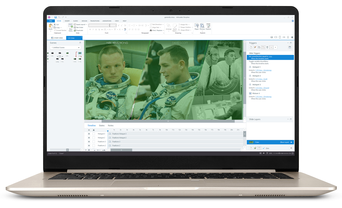
I chose to develop this in Articulate Storyline, because:
- I am very familiar with Storyline, its advantages and limitations.
- The end result should be available on the kiosk, the web, and through mobile devices, which Storyline can publish to.
I had to be inventive about how to structure this project in Storyline. Here are a few things that are somewhat novel in this project:
- The title and menu should be available at all times, so I put them on a Master Slide Layer and have a trigger to show the layer whenever a variable changes. Then I change the variable whenever the user changes slides and when new layers are shown. This pops that layer on top of everything. Storyline does not have an “always on top” option, and this works flawlessly.
- The menu within the “Flight” section is unique and engaging as it expands and immerses the user in each topic. This is done through multiple layers and motion guides.
- I create a user-based touch and drag 3D rotation by putting every image we had rendered in 3D into a separate state, and when the user moves a slider, the correct image loads based on where the slider’s variable is.
I will be creating a few videos showing how I created elements of this project in Storyline. Stay tuned!
RESULTS

The museum staff is always talking to their visitors and gathering information on their museum experience. This allows them to understand where they were engaged and their increase in knowledge. The kiosk has had great results from visitors and even special guests, such as Mark Armstrong, Neil Armstrong’s son, who has approved!
As the museum has just enabled WiFi that reaches this location in the museum, we will begin to gather data on what screens/information everyone interacts with so we can expand on the most used areas.
I have also had the opportunity to people watch at the museum. Kids and adults confidently walk up to the kiosk and began interacting. I saw kids using it by themselves and then peering into the spacecraft. I saw parents reading to their kids what they discovered (some pretending they knew all this information before). I saw adults spend a substantial amount of time reading and watching videos on the kiosk then looking up at the spacecraft, back down at the kiosk, back up to the spacecraft…I could have watched it all day. I am grateful to have had this opportunity to provide this educational experience covering such an interesting and amazing episode in our space program.
And the kiosk just won a Brandon Hall Award for eLearning Excellence – Best Advance in Custom Content! More on this soon.

Check out this eLearning adventure:
Connect with me to discuss your eLearning project. Or check out the other areas of my site.